With my freshly scraped and cleaned CSV in hand, I started digging into Pandas , Matplotlib and Seaborn to plot my first chart.
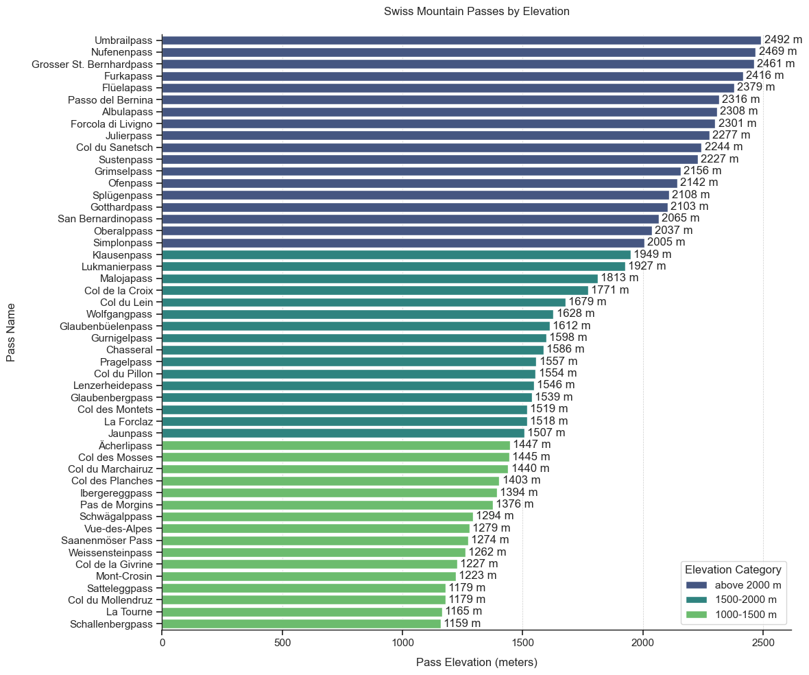
I decided to start with a classic overview by sorting the passes by elevation.
Important note
📌 The highest points might differ slightly from the maximum elevations listed in other sources. In most cases, the passes are shown a few meters higher elsewhere. I based my measurements on GPX data, which always refers to the highest point on the road itself, not to parking areas or viewing platforms.
Overview over the dataset
🔍 You can see the code of the overview here:
import pandas as pd
import seaborn as sns
import matplotlib.pyplot as plt

# Load dataset
df = pd.read_csv("paesse.csv", sep=";")

# Define elevation category
def elevation_category(m):
    if m <= 1500:
        return "1000-1500 m"
    elif m <= 2000:
        return "1500-2000 m"
    else:
        return "above 2000 m"

df["elevation_category"] = df["passhöhe"].apply(elevation_category)
df_sorted = df.sort_values(by="passhöhe", ascending=False)

# Set visual theme
sns.set_theme(style="ticks")

# Plot
fig, ax = plt.subplots(figsize=(12, 10))

barplot = sns.barplot(
    x="passhöhe",
    y="name",
    data=df_sorted,
    hue="elevation_category",
    dodge=False,
    palette="viridis",
    ax=ax
)

# Add labels
for container in ax.containers:
    ax.bar_label(container, fmt="%.0f m", label_type="edge", padding=3)

# Labels and layout
ax.set_xlabel("Pass Elevation (meters)", labelpad=10)
ax.set_ylabel("Pass Name", labelpad=15)
ax.set_title("Swiss Mountain Passes by Elevation", pad=20)
ax.legend(title="Elevation Category", loc="lower right")

# Spines
ax.spines["top"].set_visible(False)
ax.spines["right"].set_visible(False)
ax.spines["left"].set_color("#181818")
ax.spines["left"].set_linewidth(1)
ax.spines["bottom"].set_color("#181818")
ax.spines["bottom"].set_linewidth(1)

# Vertical "height lines"
ax.grid(True, axis="x", linestyle="--", linewidth=0.5, color="#CCCCCC")
ax.grid(False, axis="y")

# Spacing
plt.subplots_adjust(left=0.25, right=0.95, top=0.9, bottom=0.1)
plt.tight_layout()
plt.show()
I also grouped them into three elevation categories:
1000 to 1500 meters
These are entry-level passes, often found in lower mountain ranges like the Jura. They require less preparation, and even in bad weather it’s usually easy to find shelter or descend quickly.
1500 to 2000 meters
This is the transition zone between the entry-level and alpine passes. They can be tricky due to temperature fluctuations, and it can get cold very quickly, especially during descents.
Above 2000 meters
This is true alpine terrain and shouldn’t be taken lightly. These passes are often exposed, with steep switchbacks, and they require more preparation in terms of weather forecasts, proper clothing, and food.
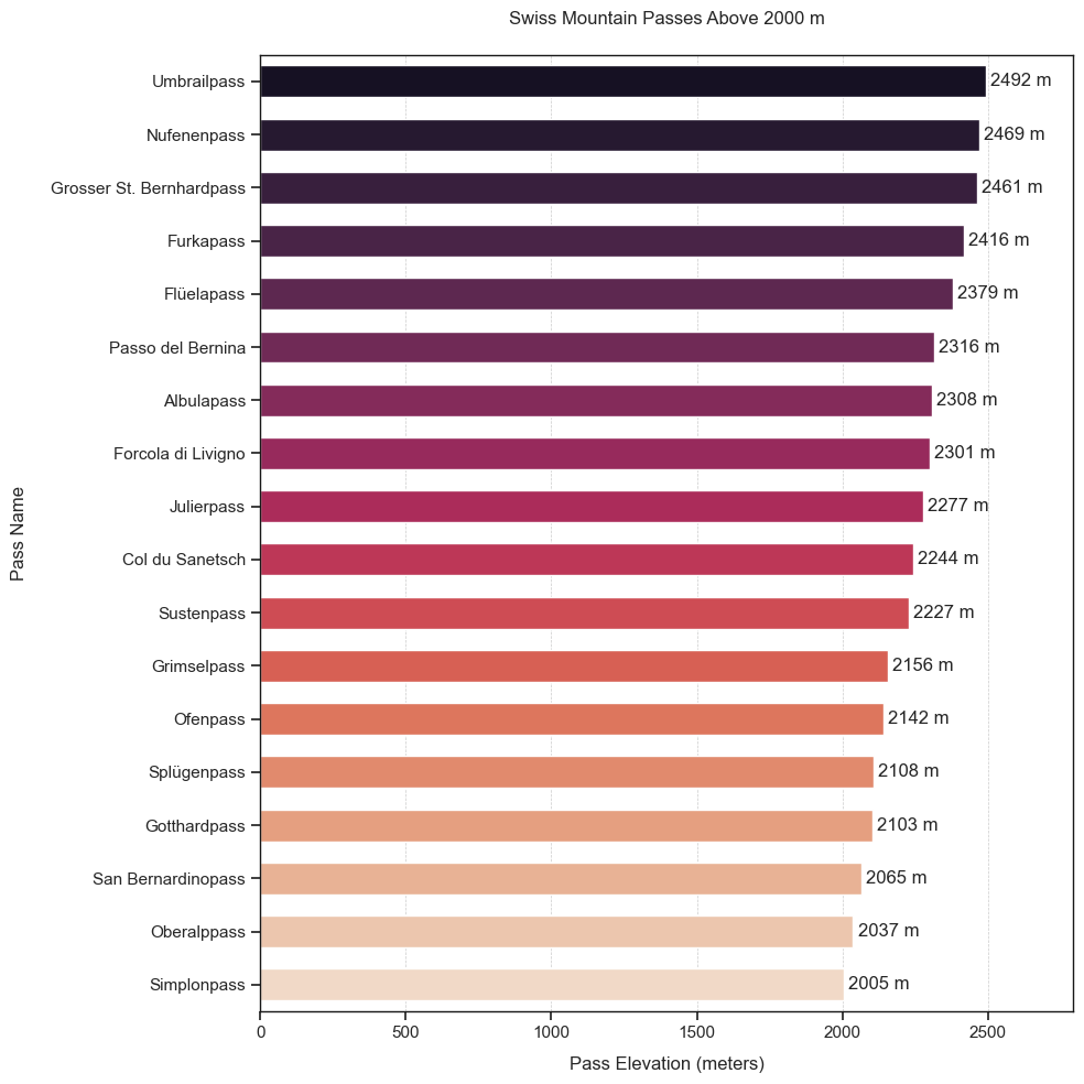
Top passes over 2000m
I also wanted to create a separate overview of the passes above 2000 meters.
🔍 You can see the code of the top passes here:
import pandas as pd
import seaborn as sns
import matplotlib.pyplot as plt

# Load data
df = pd.read_csv("paesse.csv", sep=";")

# Filter: only passes above 2000 meters
df_above_2000 = df[df["passhöhe"] > 2000].sort_values(by="passhöhe", ascending=False)

# Plot style
sns.set_theme(style="ticks")
fig, ax = plt.subplots(figsize=(10, 10))

# Gradient color across bars (not within each bar)
rocket_palette = sns.color_palette("rocket", n_colors=len(df_above_2000))

barplot = sns.barplot(
    data=df_above_2000,
    x="passhöhe",
    y="name",
    hue="name",
    dodge=False,
    palette=rocket_palette,
    ax=ax,
    width=0.6,
    legend=False
)

# Add labels
for container in ax.containers:
    ax.bar_label(container, fmt="%.0f m", label_type="edge", padding=3)

# Labels and title
ax.set_xlabel("Pass Elevation (meters)", labelpad=10)
ax.set_ylabel("Pass Name", labelpad=15)
ax.set_title("Swiss Mountain Passes Above 2000 m", pad=20)

# Spines (borders)
for spine in ["top", "right", "left", "bottom"]:
    ax.spines[spine].set_visible(True)
    ax.spines[spine].set_color("#181818")
    ax.spines[spine].set_linewidth(1)

# Gridlines (only on x-axis, for orientation)
ax.grid(True, axis="x", linestyle="--", linewidth=0.5, color="#CCCCCC")
ax.grid(False, axis="y")

# Add extra space on the right
xmax = df_above_2000["passhöhe"].max()
ax.set_xlim(0, xmax + 300)

plt.tight_layout()
plt.show()
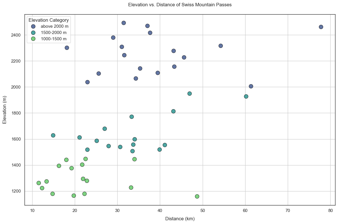
How does the overall elevation correlate with the length of the route?
I found that routes leading to higher mountain passes tend to be slightly longer overall. In many cases, the approach from civilization takes more time. A clear outlier: the Great St. Bernhard Pass, with nearly 80 km of route length.
🔍 You can see the code of the top passes here:
import pandas as pd
import seaborn as sns
import matplotlib.pyplot as plt

# Load data
df = pd.read_csv("paesse.csv", sep=";")

# Elevation categories
def elevation_category(m):
    if m <= 1500:
        return "1000-1500 m"
    elif m <= 2000:
        return "1500-2000 m"
    else:
        return "above 2000 m"

df["elevation_category"] = df["passhöhe"].apply(elevation_category)

# Set theme
sns.set_theme(style="whitegrid")
fig, ax = plt.subplots(figsize=(12, 8))

# Scatterplot: Distance vs. Elevation
scatter = sns.scatterplot(
    data=df,
    x="distanz_km",
    y="passhöhe",
    hue="elevation_category",
    palette="viridis",
    s=100,
    edgecolor="black",
    alpha=0.8,
    ax=ax
)

# Labels & title
ax.set_title("Elevation vs. Distance of Swiss Mountain Passes", pad=20)
ax.set_xlabel("Distance (km)", labelpad=10)
ax.set_ylabel("Elevation (m)", labelpad=10)
ax.legend(title="Elevation Category", loc="upper left")

# Spines: all four sides visible & dark gray
for spine in ["top", "right", "left", "bottom"]:
    ax.spines[spine].set_visible(True)
    ax.spines[spine].set_color("#181818")
    ax.spines[spine].set_linewidth(1)

plt.tight_layout()
plt.show()
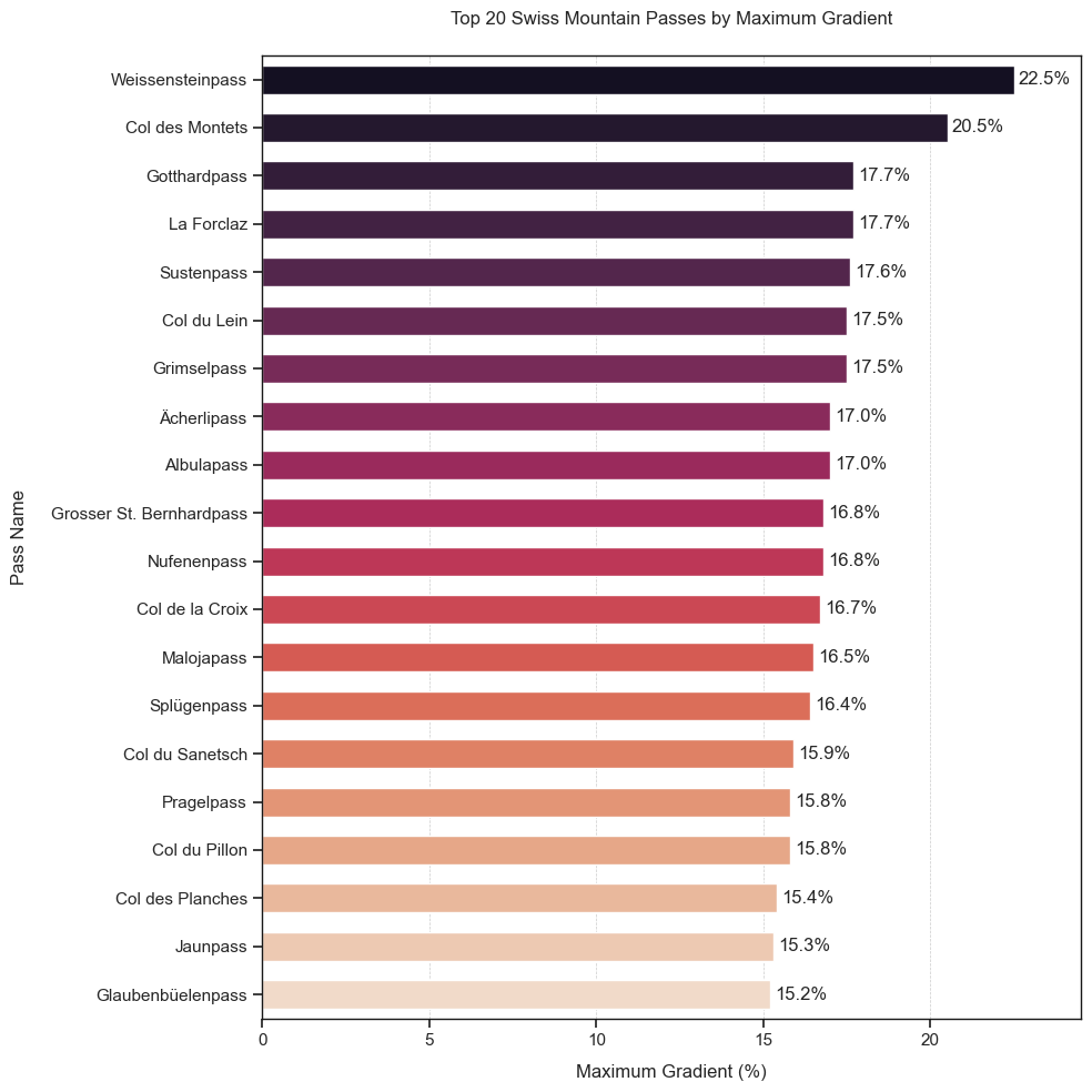
Which one is the steepest?
Everything above 15% is steep. But if a track hits 20% or more, you’ll probably have to push. Weissenstein and Col des Montets both have some serious segments.
🔍 You can get a glimpse of the steepness here:
import pandas as pd
import seaborn as sns
import matplotlib.pyplot as plt

# Load data
df = pd.read_csv("paesse.csv", sep=";")

# Sort and select top 20 steepest passes
df_top20 = df.sort_values(by="max_steigung", ascending=False).head(20)

# Plot style
sns.set_theme(style="ticks")
fig, ax = plt.subplots(figsize=(10, 10))

# Gradient color across bars (not within each bar)
rocket_palette = sns.color_palette("rocket", n_colors=20)

barplot = sns.barplot(
    data=df_top20,
    x="max_steigung",
    y="name",
    hue="name",
    dodge=False,
    palette=rocket_palette,
    ax=ax,
    width=0.6,
    legend=False
)

# Add value labels
for container in ax.containers:
    ax.bar_label(container, fmt="%.1f%%", label_type="edge", padding=3)

# Labels and title
ax.set_xlabel("Maximum Gradient (%)", labelpad=10)
ax.set_ylabel("Pass Name", labelpad=15)
ax.set_title("Top 20 Swiss Mountain Passes by Maximum Gradient", pad=20)

# Spines (borders)
for spine in ["top", "right", "left", "bottom"]:
    ax.spines[spine].set_visible(True)
    ax.spines[spine].set_color("#181818")
    ax.spines[spine].set_linewidth(1)

# Gridlines (only vertical, for orientation)
ax.grid(True, axis="x", linestyle="--", linewidth=0.5, color="#CCCCCC")
ax.grid(False, axis="y")

xmax = df_top20["max_steigung"].max()
ax.set_xlim(0, xmax + 2)

plt.tight_layout()
plt.show()
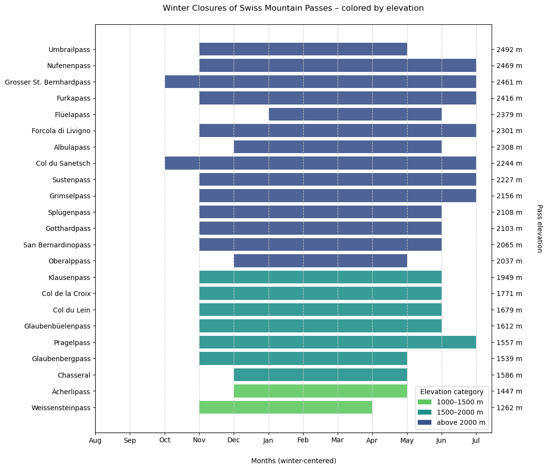
Winter Closures
Many passes close during winter. I wanted to find out when they close and for how long.
🔍 You'll find the code to this plot here:
import pandas as pd
import matplotlib.pyplot as plt
import seaborn as sns

# Load the dataset
df = pd.read_csv("paesse.csv", sep=";")
df["passhöhe"] = pd.to_numeric(df["passhöhe"], errors="coerce")

# Define elevation category
def elevation_category(m):
    if pd.isna(m):
        return "Unknown"
    elif m <= 1500:
        return "1000-1500 m"
    elif m <= 2000:
        return "1500-2000 m"
    else:
        return "above 2000 m"

df["elevation_category"] = df["passhöhe"].apply(elevation_category)

# Filter: only passes with winter closure
df_sperre = df[df["wintersperre"] == "Ja"].copy().reset_index(drop=True)

# Define custom month order (centered around winter)
reordered_months = [8, 9, 10, 11, 12, 1, 2, 3, 4, 5, 6, 7]
month_labels = ["Aug", "Sep", "Oct", "Nov", "Dec", "Jan", "Feb", "Mar", "Apr", "May", "Jun", "Jul"]
month_map = {mo: i + 1 for i, mo in enumerate(reordered_months)}

# Color palette by elevation category
palette = {
    "1000-1500 m": sns.color_palette("viridis", 3)[2],
    "1500-2000 m": sns.color_palette("viridis", 3)[1],
    "above 2000 m": sns.color_palette("viridis", 3)[0]
}

# Process closure periods
sperren_shifted = []
for i, row in df_sperre.iterrows():
    try:
        start = int(row["sperre_beginn"])
        ende = int(row["sperre_ende"])
        m_start = month_map.get(start)
        m_ende = month_map.get(ende)
        if m_start is None or m_ende is None:
            continue

        color = palette.get(row["elevation_category"], "#CCCCCC")
        elevation = row["passhöhe"]

        if m_ende >= m_start:
            sperren_shifted.append((i, m_start, m_ende - m_start + 1, color, elevation))
        else:
            sperren_shifted.append((i, m_start, 12 - m_start + 1, color, elevation))
            sperren_shifted.append((i, 1, m_ende, color, elevation))
    except Exception:
        continue

# Plot
fig, ax = plt.subplots(figsize=(12, 10))

for y, start, duration, color, _ in sperren_shifted:
    ax.broken_barh([(start, duration)], (y - 0.4, 0.8), facecolor=color, alpha=0.9)

ax.set_yticks(range(len(df_sperre)))
ax.set_yticklabels(df_sperre["name"])

# Secondary y-axis showing elevations
ax2 = ax.twinx()
ax2.set_ylim(ax.get_ylim())
ax2.set_yticks(range(len(df_sperre)))
ax2.set_yticklabels([f"{int(h)} m" for h in df_sperre["passhöhe"][::-1]])
ax2.set_ylabel("Pass elevation", rotation=270, labelpad=30)

# X-axis and labels
ax.set_xticks(range(1, 13))
ax.set_xticklabels(month_labels)
ax.set_xlabel("Months (winter-centered)", labelpad=20)
ax.set_title("Winter Closures of Swiss Mountain Passes – colored by elevation", pad=20)
ax.invert_yaxis()
ax.grid(True, axis="x", linestyle="--", color="#CCCCCC")
ax.spines["top"].set_visible(False)
ax.spines["right"].set_visible(False)

# Legend
from matplotlib.patches import Patch
legend_elements = [Patch(facecolor=color, label=label) for label, color in palette.items()]
ax.legend(handles=legend_elements, title="Elevation category", loc="lower right")

plt.subplots_adjust(left=0.2, right=0.88, top=0.92, bottom=0.08)
plt.show()
👉 This small project provided a great first dive into Pandas, Matplotlib and Seaborn. Along the way, a few interesting insights emerged. It would be exciting to take things further by mapping the data, exploring it in 3D or building something interactive.
For now, it was satisfying to gain a clear sense of the key characteristics of the passes, such as elevation, distance, gradient and seasonality, and to lay the foundation for future ideas.